
The wireframing process was a challenge.Ihad to follow some rules in order to make everything match what the company needed from me to what would be more beneficial for the users.
The company required:
- The information on the previous website should be the one applied,
- Remember that the information, such as text, images or videos, would be changed after the layout was complete.
- Keep in mind that the software is still growing, so it had to be able to expand for more features
- A button to direct the customer to the software was mandatory
The proposal
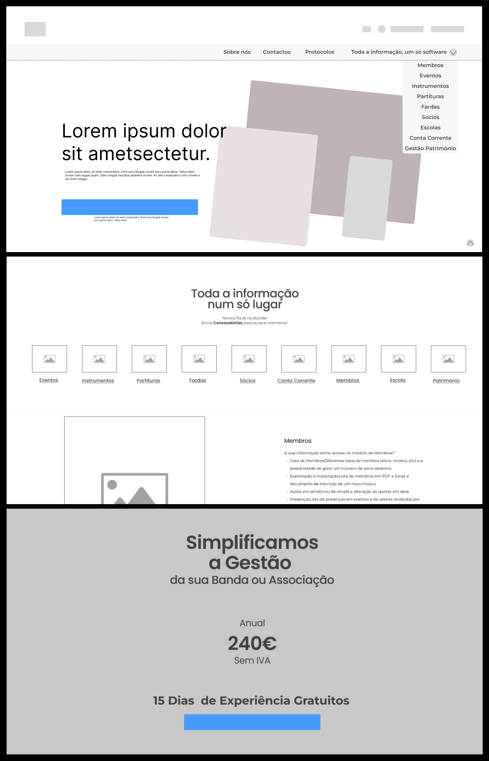
A big hero section with a call-to-action button for the purchase. Since this is where the client lands, I really wanted to make a statement in this first image. I followed it with a set of icons that represent some of the main things the clients search for.
I meant to keep it on one single page, so the user wouldn't need to switch to see all the software had to offer. For that, a dropdown on the top navigation bar would work to move the client to the different anchors on the page, and the bottom arrow on the right would work as the anchor to the top.
Finishing the page, a clean card with the price, and a button for the purchase.
On the top of the page, there are two fixed buttons, the right one for the purchase and the left one to redirect the client to the software as demanded by the company.